LETTERKENNY TENNIS CLUB
Logo Identity Design and Branding
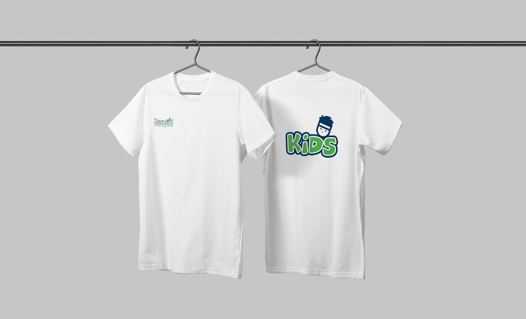
To create a master visual identity for the Club along with two other logos to represent the teenage and younger members. This trio of logos were to be friendly and welcoming but at the same time represent the drive and dedication needed of a tennis player in a competitive sport, especially in the teenage and adult member categories.
The first step was a brand discovery and audit to determine their design requirements and take an in-depth look into their current brand collateral, consumer perception, sector competition and target market.
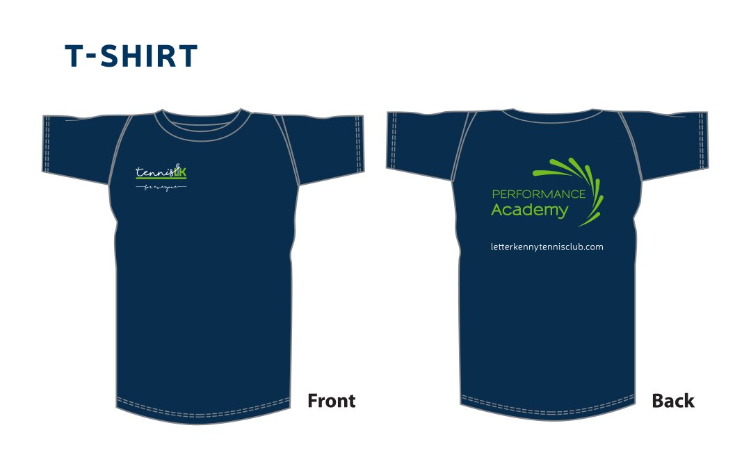
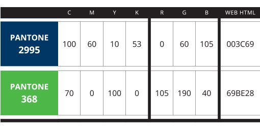
A colour palette of dark blue and green was chosen. This was applied to all 3 logos for brand consistency. Both the Master Logo and Academy logo represent the movement of the ball in the air. For the Master identity, the balls trajectory spells the word Tennis. For the Performance Academy logo, the design represents the ball being served many times over and each time it moves in a slightly different direction. This illustrates the idea of ‘practice, practice, practice’.
The logos can be used independently or bolted together when needed.
Different fonts were used for each identity: the script font in the Master Identity is personable and welcoming, the clean, modern font in the Academy logo appeals to the teenage members and the cartoon style font appeals to the younger age group in the Kids Logo.
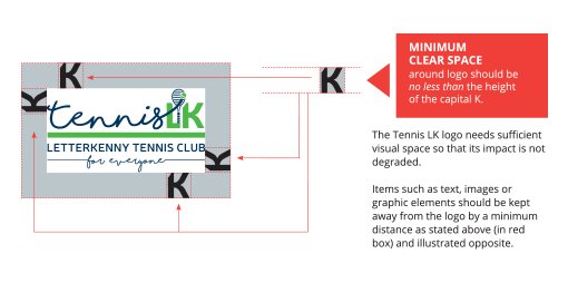
A ‘brand pack’ was supplied which included the brand guidelines document along with the various file types for both print and digital use. This ensures the logos will be reproduced accurately no matter which service provider is used.




Janine is a very talented designer who is really easy to work with. She is very accessible and really listened to what we wanted. She was able to capture the spirit of our club and we are delighted with the logo designs she created for us. No doubt, we would highly recommend JKS Design!
